The business name:
We researched and strategized on the business structure, in this case it was for a private ambulance service, taking the elderly and disabled to and from hospital appointments. This service was going to be a luxury service and so we took that into account when coming up with a name for the company.
The name upscale transport came to life as it is transportation as well as being luxury. We also planned to have the elderly and disabled in mind when coming up with the branding so as to ties it all together.
The business colouring:
We wanted something that would be medical but not sterile. We wanted colours that will be warm and inviting.
Green = Medical
White = Clean, peaceful
Blue = Calm, loyalty and trust

The fonts:
We wanted the fonts to show caring, friendly, and supportive. We came up with “Object Extra Bold” as this is a heavy font which shows support and reliability as well as being rounded depicting a friendly service.
The Branding:
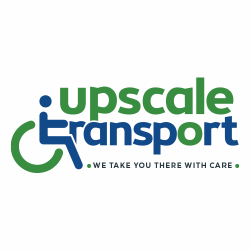
We needed to bring in the elderly and disabled into the branding and we wanted it to be seen and understood straightaway. Therefore we incorporated the wheelchair into the logo as this shows at first glance what the business is about, the wheelchair that we decided on was rounded so as to show an open friendly approach.

And so came about the logo of upscale transport.

We decided we still want to add exactly what we do in a tagline underneath, we wanted something concise and easy to understand, we brainstormed and came up with “We take you there with care”.
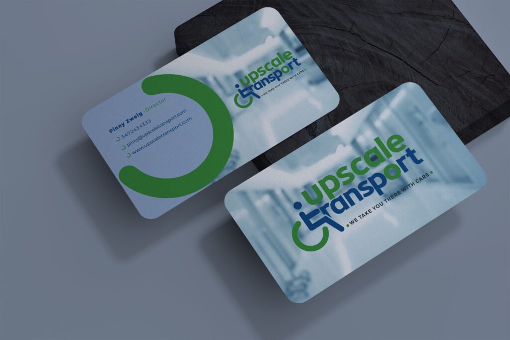
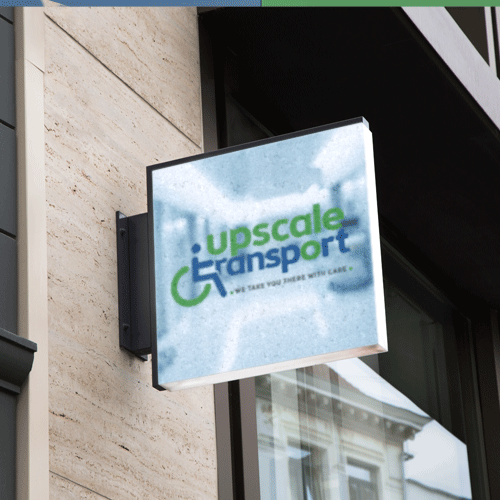
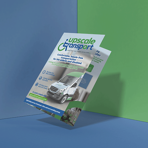
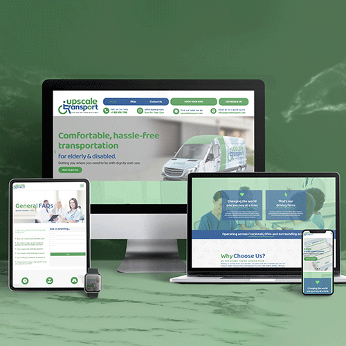
As you will see from the next few images how the branding has been incorporated into the website and all the printable items.
We hope you enjoyed this and that you will follow along for many more logos and brandings that we do.


