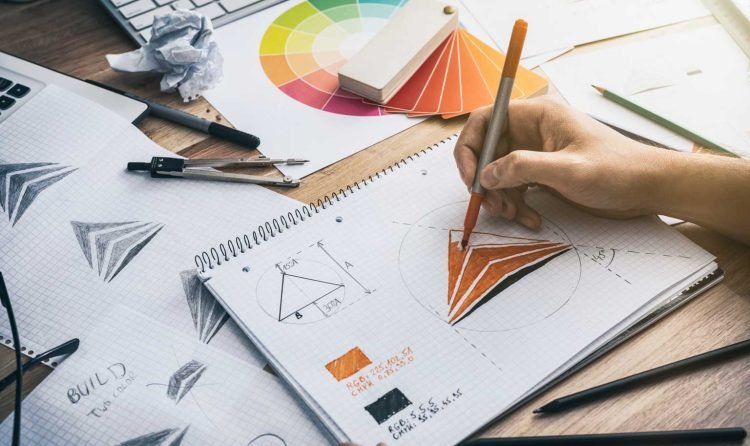
Graphic design is all about communicating an idea or message in a visual way, we do so with some key elements in mind.
Line, shape, form, texture, space, imagery, typography and colour. When we understand each of these basic elements of graphic design it will help you see how we bring them together and open a whole world of creative possibilities.
Lines:
We describe this as the building blocks of design, lines can be continuous or broken, straight or curved, smoothed or zigzagged and beyond and we use them for more than just outlines or dividing up content. They convey movement or tie together the composition that we are depicting.

Shape:
We use lines to create our own shapes. When we create our own lines and shapes especially for logos, we need to make sure that all the elements are properly aligned and symmetrical so that it would be pleasing to the eye.

Form:
We sometimes make our shapes three dimensional to give it form, which is such a vital part in graphic design. Just like shapes, they can be organic or geometric forms and these create very different impacts – geometric forms tend to convey order and can seem sterile and concise, whereas organic forms feel more natural and flowing.

Texture:
The surface quality of designs is called texture, and it can bring another dimension to the design. There are many ways that we add texture into graphic design material, from making our own brush strokes to give texture to lines, to drawing our own patterns.

Space:
In graphic design there are both positive space – the focus of the design, and negative space which is the background. With these spaces it is possible to use positive space in a way that recedes as your eyes track down the design, or to draw the eye towards a shape in the background with negative space.

Imagery:
If an image is worth a thousand words, knowing how to use an image will assist us in delivering the message in a more effective way than text alone. For a cohesive design we choose images that are contextually relevant, convey the right message and tone and look authentic.

Typography:
Many designs include some kind of copy on them, which means that the typography is another element of graphic design that is a little complex to understand. We sometimes find it a challenge to get the right balance between setting the tone with stylised font and using something that is easy to digest.
When it comes to fonts, the header or title will usually call for a display typeface. These draw the most focus. This means that for the body we usually do the opposite and stick to very plain and easy to comprehend fonts.
We also make sure that there is enough variation in the sizes, weights and thicknesses so as to keep the reader interested.

Colour:
You might think that our options are infinite when it comes to choosing a colour palette, but a key element is to understand the colour wheel and how to find the right shades with it. We either go for complementary colours, triad colours or monochromatic shades. We try to stick to either cool or warm colours.

We hope you enjoyed understanding a little what goes behind the thought process of designing.


